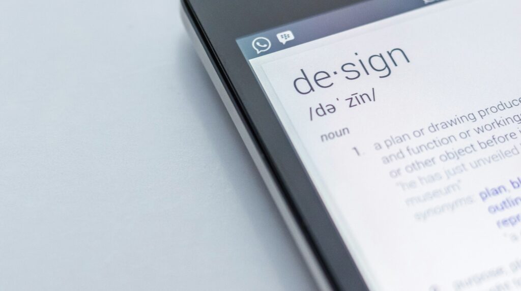
My intention here is not to try to answer the question of whether design can be viewed as art, nor whether it cannot be due to its very nature – that is a discussion for another time. What I will try to do is take a high level look at what design is, what makes good design and how this can help you.
There are many opinions surrounding form over function and how this is generally understood as the path to poor design. This is often demonstrated by clients and designers alike, who might push a visual idea just because they like the way it looks, without data to validate whether this approach is likely to succeed.
However, I believe that the opposite approach, of choosing function over form, is equally bad practice. Creating a UI that is solely data-driven with little or no consideration as to how it looks is fundamentally at odds with good – and therefore valuable – design.
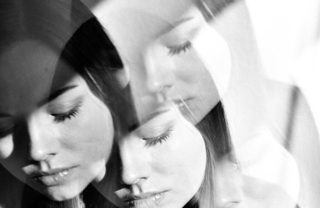
Let’s begin by examining what is meant by ‘how it looks’. We can break this notion down further by asking why a design should look a certain way, and how a design should look a certain way. The outcomes of these two questions shouldn’t overlook the importance of a key factor – one that often escapes the attention it so desperately deserves – the emotion in a user’s journey.
We’ll come back to the emotion element but firstly, it would be useful to clarify what is meant by the ‘why’ and ‘how’. Whilst at risk of oversimplifying, we could consider the ‘why a design should look a certain way’ as the UX process and the ‘how a design should look a certain way’ as the UI process. UX focuses on the question of why a design needs to be a certain way supported by the evidence we have of this, while UI focuses on how these findings are visually inferred. There is much crossover between the two disciplines but that gives at least a good enough overview.
Emotions are often formed by our experiences, so we use data captured from ‘similar’ users’ experiences in similar situations to predict how our user will respond to the app we’re designing. This doesn’t take into account however, the environment we’ve created for the user, how they’ll respond to it, how it will make them feel and how those feelings will guide their experience of using our product. Enter the ‘how’ – UI design – which, when taken in tandem with UX design, will define these parameters. Enter colour, colour theory, typography and its rich history, enter the lessons of visual hierarchy that cut its teeth in print before moving on to the digital realm, enter how all these elements coming together will make the user feel, make us all feel – enter our emotions.
Good design must solve the problems it sets out to and will possibly solve a few other problems along the way. Because of this, it cannot exist as an entity completely of its own importance, but the way it looks holds part of the key to its success.
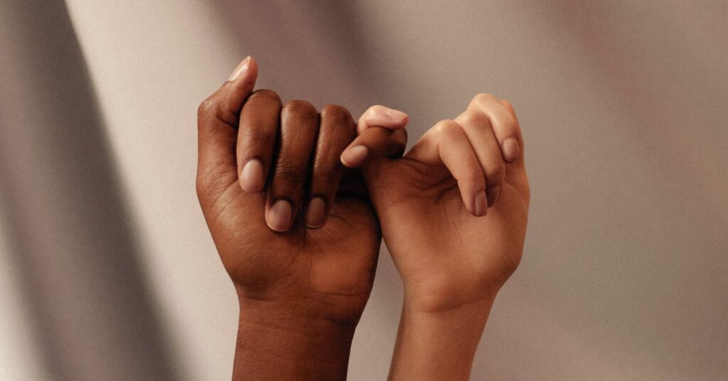
Perhaps another way of looking at it would be to say yes, design should be led by function (in order to solve the problems it is required to) but this should always be done whilst holding the hand of form. It is indeed the excitement of how these two elements play off each other, an understanding that they are better together, a union, a courtship that defines just what good design looks like.